Corporate
Writing & Editing
Clarity shapes how information is presented, systems thinking informs how content is organized, and audience awareness ensures writing is precise and usable. When combined, they turn words and design into intuitive, meaningful experiences.
Student Loan Research Guide
Designed to support informed borrowing decisions through plain-language guidance.
2024
Article
Written to show how content can support people in systems where experiences vary. This article uses clear expectation setting, transparency, and plain explanations to help users navigate inconsistency in host-driven marketplaces, shifting the role of writing from persuasion toward informed decision-making.
2026
Blog Article
A systems-level look at how cognitive load accumulates in team members and how design can reduce it.
2025
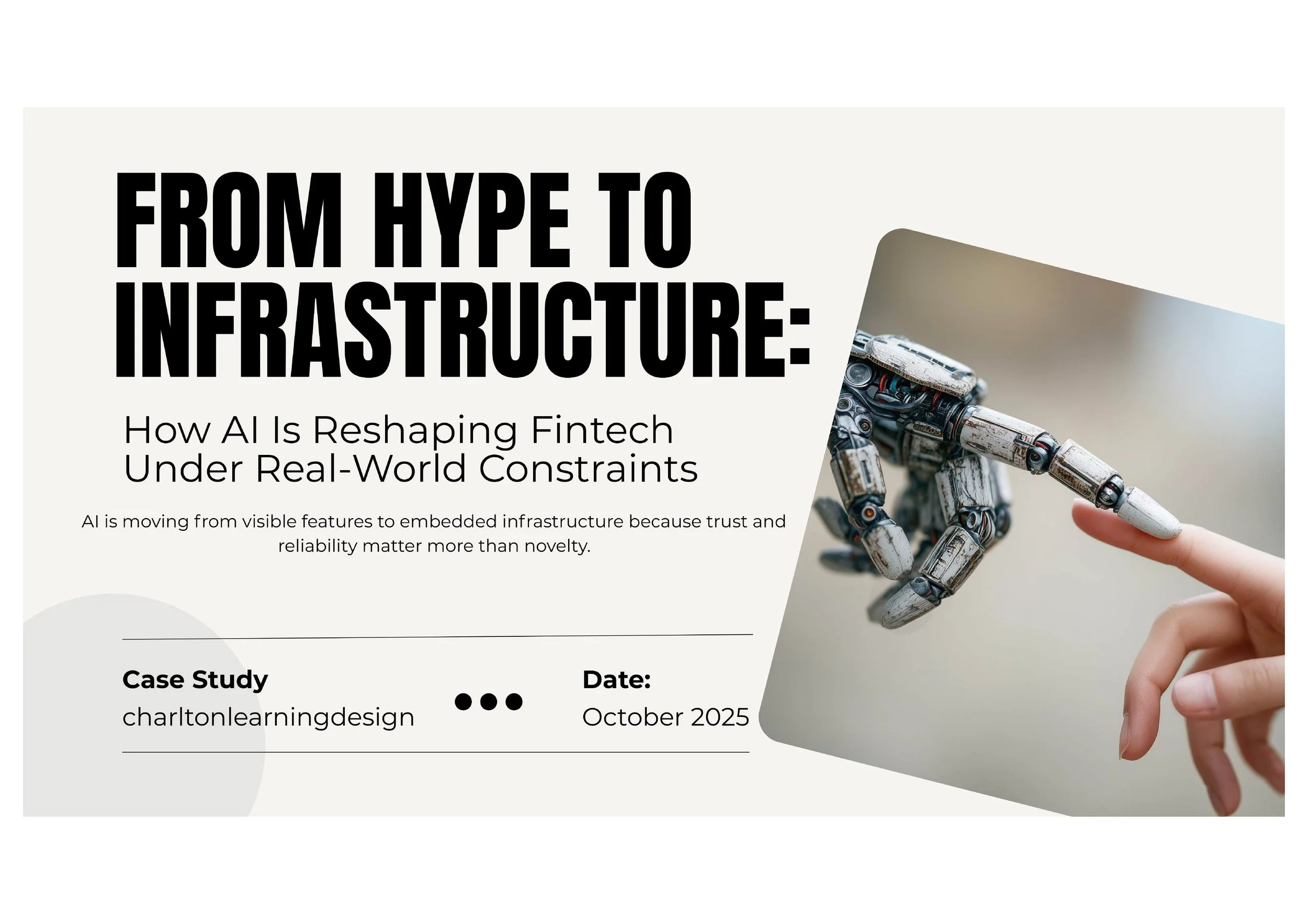
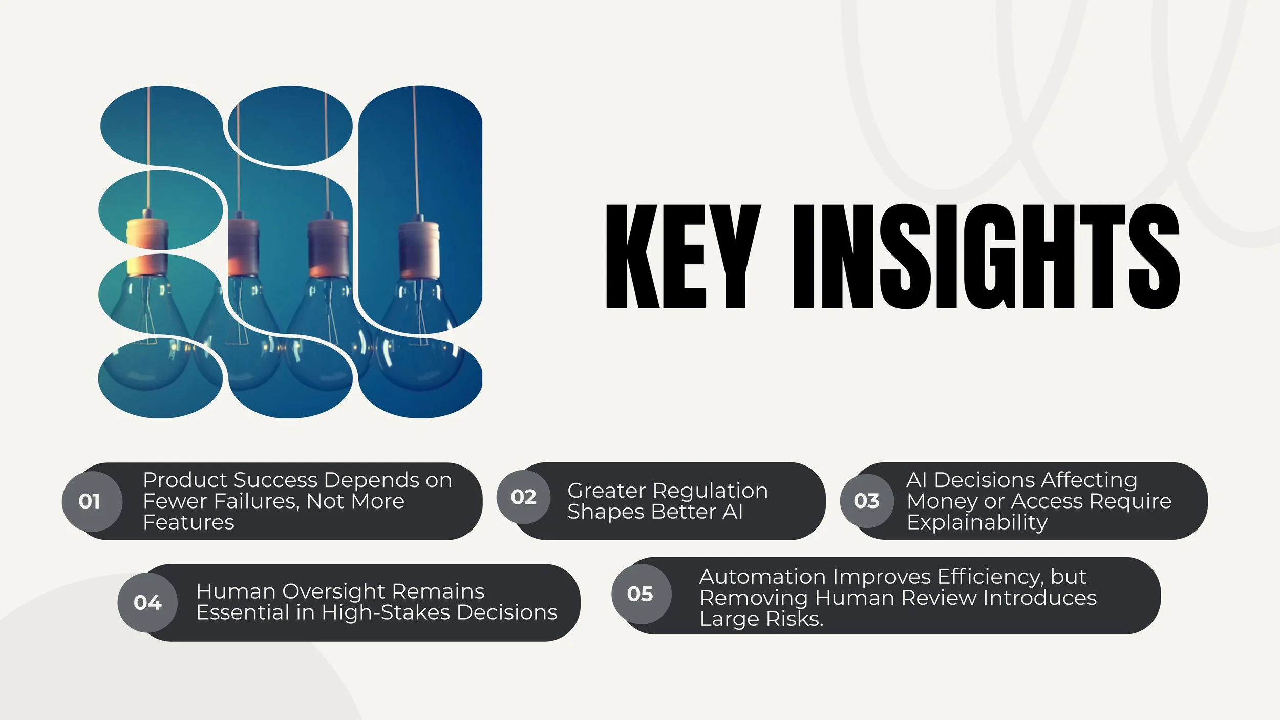
Case Study FinTech
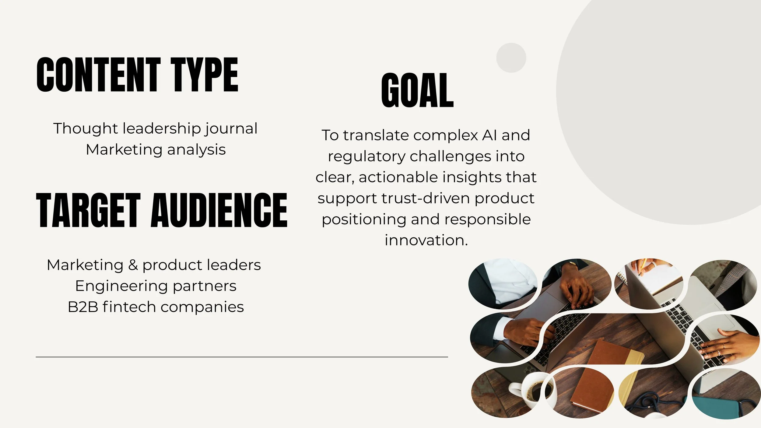
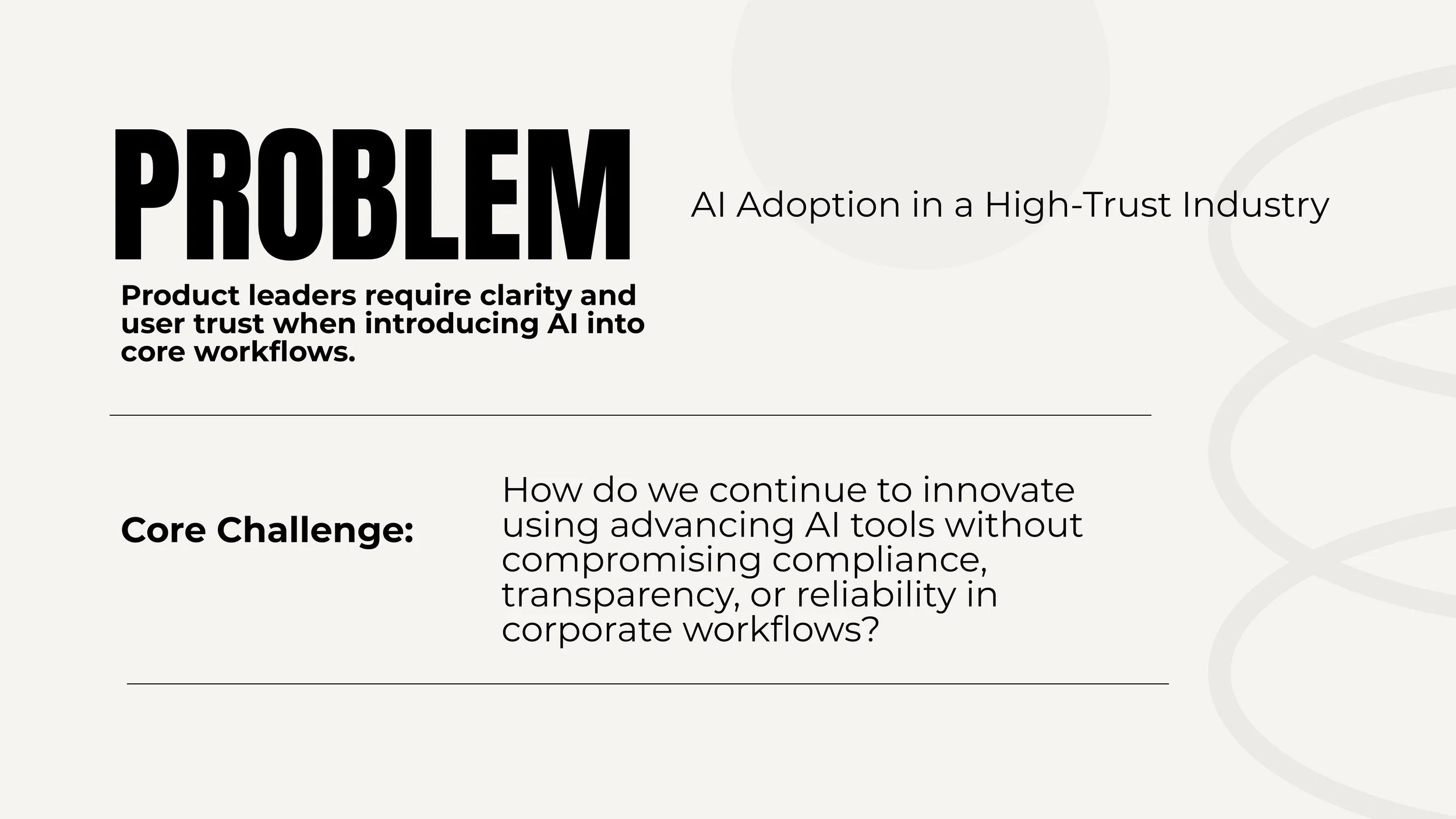
Audience considerations shape corporate risk-reduction content to support confident action.
When applicable, I use realistic, empathy-rooted language to frame problems.
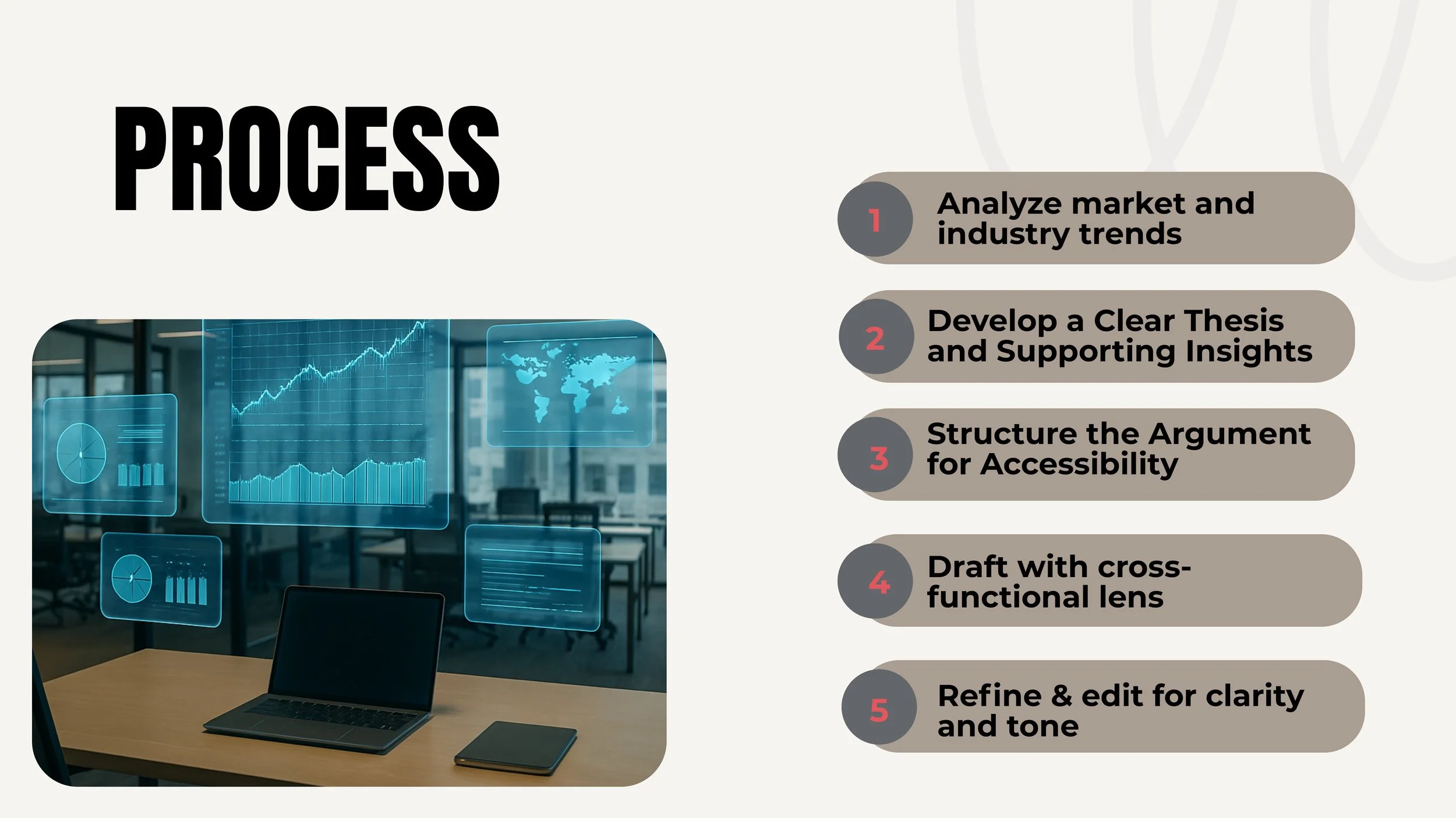
Well structured content-development begins with uncertainty and ends in clarity.
These insights combine research findings with systems thinking, empathy, and risk-aware editorial judgment.
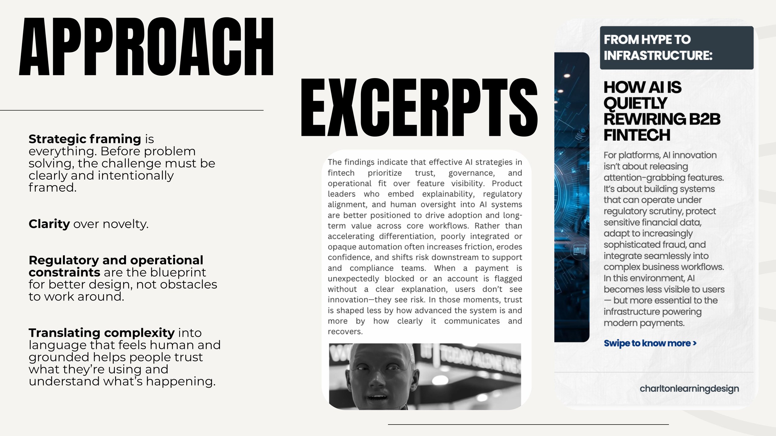
Approach: Write to reduce ambiguity in complex, high-risk scenarios. Demonstrated in writing: Action-focused, human language that supports decisions without suggesting outcomes.
Proposal
Sample RFP Response (Excerpts)
Excerpts that show my approach to first-draft proposal writing, clear solution framing, and practical, plain-language compliance content for a mid-market cloud buyer.
2025

Education-Based Work
Empathy guides how I understand learners, research grounds my decisions in evidence, and audience awareness ensures instruction is accessible, relevant, and actionable. Together, these inform learning designs that respect real-world constraints while supporting effective outcomes.
UX Design Project
Canvas Mobile App
sample project
2023
Problem: Students are the primary users of the Canvas mobile app but the layout is not user-friendly or intuitive for an audience ranging from elementary schoolers to college learners.
Solution: Reduce visual and cognitive overload on the student end. Simplify the layout by offering fewer options on each page.
Research: Student usage of Canvas mobile indicates an unsurprising jump from 2018 to 2020. However, the growth has been less consistent since then.
Student submissions through the mobile app indicate a similar trend.
Learning on-the-go has increased since 2018 yet students are not utilizing the mobile app at the rates they could.
Strategy: Keep home dashboard the same but design a more useful path to the content that matters most to students.
The original home dashboard is easy to navigate, but once students select a course, the screen options become overwhelming.
On average, students only access 5 of the 10+ options.
Individual course screens offer the 3 primary options used by students as CTA buttons. Within these 3 buttons, users will encounter secondary and tertiary buttons to access additional resources that once lived on the course home screen.
How it works
Proposed user flow diagram
Modules are frequently accessed by mobile users. Users can scroll through the modules and click for instructional details. A button for Pages is featured on the Modules screen since Pages are used for additional class files and resources. The Grades button provides users access to view their course progress.
Not all assignments are created equal, so they shouldn’t be treated that way. Users can now quickly see which tasks are due soon and which are missing, without having to sift through a long list.
Micro-Learning
This micro-learning example highlights clear instructional writing, thoughtful content sequencing, and learner-focused structure. The training translates ADHD research into accessible, classroom-ready strategies for educators navigating everyday instructional challenges.
2022
Communications Sample
A multi-format communications sample demonstrating how a single education initiative is translated into a cover page, short-form social content, a brief newsletter, and a step-by-step learner guide. Created to show executional writing, message consistency, and adherence to templates and brand guidelines.
2025
Article
This article explores widening math gaps and the unintended consequences of instructional approaches that prioritize comfort over progression. Using research-informed analysis, it argues that meeting students where they are without structured pathways forward can hinder mastery, persistence, and cognitive development in mathematics.
2021
Case Study
This case study demonstrates a methodical approach to evaluating school safety models, combining research synthesis, risk analysis, and contextual factors specific to the campus. The analysis was adapted into an comprehensive safety plan and training framework.
2023